
Kaplan-Meier Curve using R
Published:
The Kaplan-Meier curve is a powerful tool in survival analysis, commonly used to estimate the probability of an event—such as survival—at different time intervals. It provides a visual representation of the time it takes for an event to occur across a patient population. This method is especially useful in medical studies where understanding survival rates is key.
However, when analyzing survival data, it’s important to consider the limitations. For instance, if you’re working with a small subset of patients, the Kaplan-Meier estimates can sometimes be misleading. Small sample sizes can lead to erratic survival curves, making it crucial to interpret the results with caution.
When comparing survival outcomes across two or more groups (e.g., treatment vs. control), the log-rank test comes into play. This statistical test helps determine if there are significant differences in survival rates between the groups.
In R, the survival and survminer packages are essential for performing Kaplan-Meier survival analysis and generating publication-ready plots. If you don’t already have these libraries installed, you can add them to your workspace using the following command:
Load Required libraries
library(survival)
library(survminer)
library(dplyr)
Read the vital dataset
base.dir = "home/user/Documents/survival_analysis"
data = read.csv(file=paste0(base.dir,"/KM_Test_data.csv"),header=T)
Examine the dataset (Vital status: 1 for dead; 0 for alive)
head(data)

ID      p16 		Status	Days
GHN-11  unknown		1  	803
GHN-15  unknown		1  	775
GHN-20  unknown		1  	150
GHN-21  unknown		0 	2036
GHN-24  unknown		1  	718
GHN-25	negative	1  	598
HN-39	positive	0	1232
Create a survival object, usually used as a response variable in a model formula.
surv_obj = survival::Surv(time=data$Days, event = data$Status)
Wrapper arround the standard survfit() function to create survival curves
fit = survminer::surv_fit(surv_obj ~ p16, data = data)
You can replace the above two steps with
fit = surv_fit(Surv(Days, Status) ~ p16, data = data)
Plot the KM curve. With pval = TRUE argument, it plots the p-value of a log rank test, which will help us to get an idea if the groups are significantly different or not.
png(filename = paste(base.dir, "KM_Plot.png", sep="/"),width = 1300, height = 1300, res=200)
ggsurvplot(fit_1, pval=TRUE, risk.table=TRUE)
dev.off()
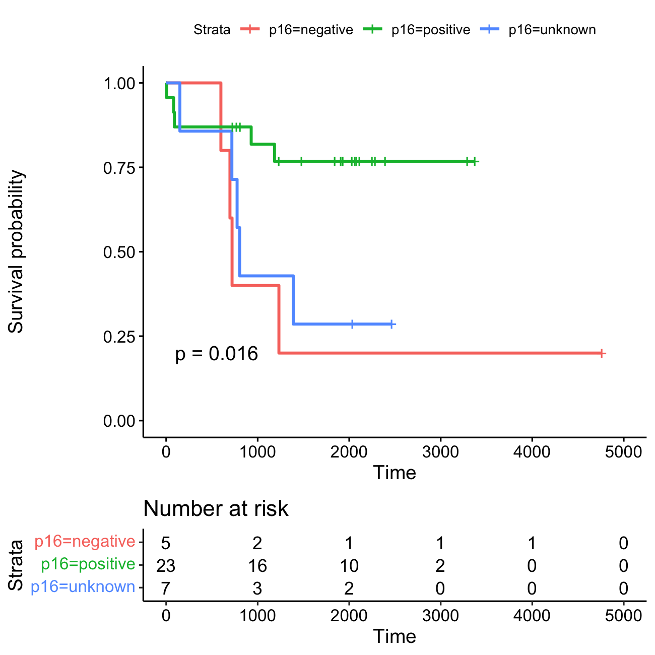
KM plot Kaplan-Meier survival curves for the three HPV-status groups: HPV-positive (N=23), HPV-negative (N=5), and HPV-unknown (N=7). Each vertical drop in the curves represents an event (e.g., death). The event rates are as follows: HPV-positive group: 5 events (21.7%), HPV-negative group: 4 events (80%), and HPV-unknown group: 5 events (71.4%).
The horizontal lines along the X-axis represent survival duration for each time interval. A vertical tick mark on the curve indicates a censored patient, meaning the patient has not experienced the event of interest (e.g., death) during the study period. When many patients are censored in a group, it raises questions about how the study was conducted or how the treatment impacted patients. This highlights the importance of displaying censored patients as tick marks in survival curves to provide a clearer interpretation of the data.
Risk table At time zero, the survival probability is 1.0 (meaning 100% of participants are alive or at risk). Initially, all 35 participants are alive or at risk. After 1,000 days, 21 participants remain alive or at risk, and by 3,000 days, only 3 participants are still alive or at risk.